
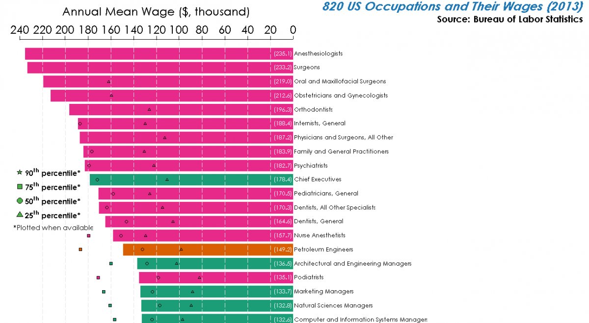
Reddit user Dan Lin has created an epic chart that shows the mean-wage breakdown for every single profession in America tracked by the Bureau of Labor Statistics.
Grow with BusinessPundit
Want coverage and growth like the brands in this story?
Most of the top wages are owned by people working in the medical field while the lowest wages are paid to people working in the food and hospitality fields.
The numbers in parentheses are the mean wages, in thousands. The different shapes show the range of salaries available in that field.
Here’s the top 20 fields followed by the much harder to read chart.
And here is the full chart, you might need to zoom in on your browser to get the full effect.


