The 2008 crash is probably the most serious economic crisis we have faced after the Great Depression. Stock markets from around the world fell as much as 20% in a single week, dozens of banks either failed or were rescued by government and private instutitions, and companies started laying off employees as a consequence of the reduced demand.
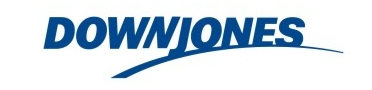
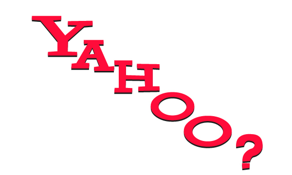
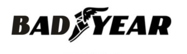
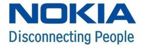
We know how we entered into the crisis, but we don’t how, when, or how we will be getting out of it. Considering that issue, we decided to our little bit to help cheer everyone up by redoing the logos of some renowned companies …. after the crisis.
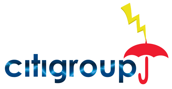


While Apple is probably one of the more stable companies in our economy, with a robust and diverse set of high-demand products… we just couldn’t resist this one.
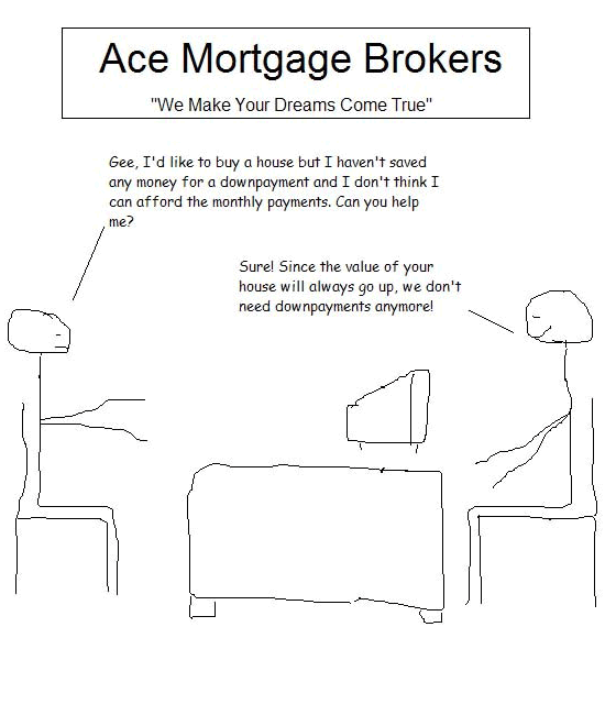
Facebook
Twitter
LinkedIn
Click the image to see the next slide.
Please make more posts like this possible by visiting the 15 Month Business Credit Card Matcher.
Logo Credits:
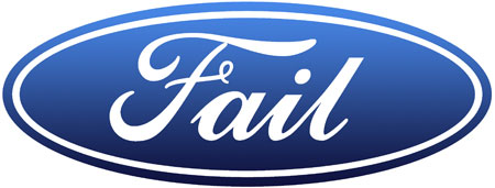
* The revised Ford logo comes courtesy of Ironic Sans
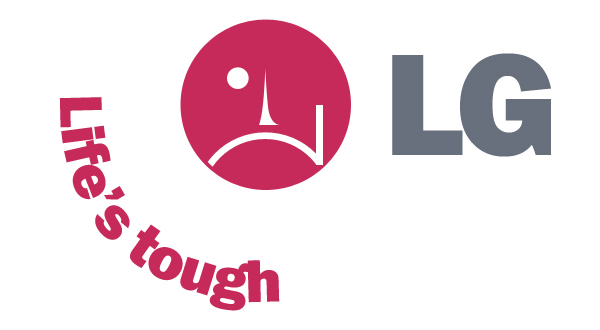
* The nokia, 3m, badyear, ferrari, xerox, downjones logos come courtesy of Carlos Bornelli Jr
I like all the bites in the Apple, haha.
Well done, nice interpretations!
Wow these logos are really funny I think I like the bonus apple logo the best.
yeah i loved the apple too!..
nice collections! nike is cute too!
Pure creative genius!
The Ferrari one says it all: The Clomping Horse.
Used to work at Best Buy’s corporate offices, and we always had to check to make sure no one wrote ‘Best But’, as the T is right next to the Y on the keyboard.
We used to make fun of Circuit City, but now there is no Circuit City to make fun of. Its ok, RadioShack will always be the easiest name to trash, and they are still around, somehow.
Oddly, this reminds me of the early rave scene, where defacing corporate logos was a key part of the sub-culture and its anti-corporate, anti-establishment, anti-evil, pro-fun, pro-youth, pro-underdog stance.
fun parody … very humorous!
ugh lern2kern
Es bueno reirse de las situaciones difĆciles!!
Nice! Apple’s stocks have lost half of their value so it really deserves that logo.
These are far funnier than most of them “funny photoshop” websites. Apart from the “fail” one, which may have been funny a couple years ago.
I do believe the yahoo one should say “Yawho?”
circuit “shitty”,… anyone, anyone?
Good job !!
Ironic that Citi ditched the umbrella logo in the beginning of the year, selling it back to Travelers Insurance for millions. Even more ironic was the slogan “You’re better off under the umbrella”- Citi obviously was; since casting previous CEO Weill’s pet logo aside last spring, it’s been a fast downhill slide.
Great logos! These are very good logo design.
Awesome, the Apple one really make sense
Hay que saberse reĆr de todo un poco, y por quĆ© no, de Apple tambiĆ©n xD
You guys are awesome, it really made me laugh.
Awesome. I just added this to my own romanian blog. |Hope you don’t mind. We’re really in the crysis :))
Xerox FTW!… The toner cartridge has just come to an end!… Money to replace it?… N…No money? :))
Really funny logos
The Xerox logo is the most subtle.. out of ink, lol
Windows Vista ———> Losedows Blind
funny
all the logos are interesting.
10x for the post
BRAVO ! ! !
loved the xerox one!
Fantasticcccccc… Here in Italy we really feel crisis. I hope as soon as possibile we will be able to overpass this period…
Life is so good dud’s don’t worry be happy…smiles..!
nice idea … entertaining to say the least …
Lex
http://www.newmediatype.com
foarte tari absolut toate :)) good job
Very sad. The new topic of discussions. Lack of IQ.
More & more brands will follow ….soooooon
Very nice logos:)
Where are the broads ? no boobies
?
Very creative! Xerox rocks!
http://files.myopera.com/Anarchy_team/blog/sorry-ericsson-logo.jpg
Oh that’s good stuff!
hahaha, that is awsome! best of them are: crisisler, bad year. xerox
economic crisis always bring out the humor in people š
nice
nice. I like that
Haha those are great!
http://www.torrenthub.org
Ha ha ha! Super! The bests: FORD and APPLE. I want more.
http://varanus.varanus.blogspot.com
crApple? Blah.
10 points!!! Very witty:)
Haha, can’t stop laughing. Great job!
amazing! I love the 2m logo… genius!
These parodies are extremely stupid. thanks for wasting my time with your unclever attempt at humor. kill yourself
Very funny
pefect.
lol
hahahahaha
Great work guys – I love the Fail-One!! Thanks :-))
Awesome š Ford one is just great š
Brilliant! I love the Ford/Fail one.
xerox and please buy, funny, funny, ahaha š
great!
ŠŠøŠ“имо, Š²ŃŠµ Š½Š°ŃŠ¾Š“Ń Š¼ŠøŃŠ° в ŠŗŃŠøŠ·ŠøŃ ŃŠæŠ°ŃŠ°ŃŃŃŃ ŃŠ¼Š¾Ńом…
Very funny, I especially like the one for Dell.
Just submitted this to Mixx for you guys!
Cheers,
Glen
Apple the bests
lol
http://www.bb-group.ru
ŠŠ° ,ŠæŃŠøŠŗŠ¾Š»Ńно )))
Га Š²Š°Š°Š±Ńе пизГеŃ
великолепно
good thoughts, good work
CTRL + ALT + DELL
ftw!
Awsome !
The Best Buy logo seems characteristic of most stores at the mall these days. While Christmas shopping, I got the distinct feel that stores were begging for my money.
It’s a piese of shit!
Extremely funny – congratulations for the idea!
hello from Ukraine. These are pretty fun
Brilliant!
i dont get the 2M one =S
Fantastic post. I love how some of the crisis parodies build off of the brand names while others cleverly tweak the logo!
Pretty nice. Dell should have been “Dole” though. (Not the pineapple, of course.)
Nice. You forgot Short-Circuit City though.
what happened to:
shitigroup ?
How appropriate & creative. I love the apple logo, and agree with you about its products. From a diehard Mac user.
Best Buy, yahoo and Apple, the best
Great job! I also liked the “Sorry Ericson” logo
superb!!! damm funny! loved xerox and apple
mmmmmm fine – Ferrari:)))))
I like the DELL logo. very subtle
Very nice “Xerox”
Top work
Maybe the Yahoo one should be ‘Boohoo’?
Its funny………but does tell us something…
Well done!
š š š
they’re good!
FERRARI :))
Wow, I just stumbled upon this site. Very nice! I like the ferrari logo
Ummmm 3m is gonna be pretty strong no matter what.Other logos funny,but be relevant.
I like the 2M logo the best. We are seeing a lot of the world’s most familar brands crumble. And the bigger they are, the harder they fall.
Great job!..but is this the best you can do? š Let us learn some more!!
Woah this is awesome š
That sort of relfects the times we’re in: age of crap and failing brands/products. Anyway, great logos!
LG Life“s Tough jaja!Excelente!
Consume.
Let us face it ratherthan commenting
All our lives are going to be effected by it.
funny and a part sadly true
I didn’t see Microsoft logo. How about it?
Horrible ;o)
perfect. you cheered me up
hy, as a German(thats also not funny at the moment) and little bit overqualified, I am happy to see your handling of the real efforts of capitalism. Nice !
ŠŃŠ»ŠøŃŠ½Š¾!
Fiasco systems summerize all
“Fail” was by far my favorite. Thanks for giving me a smile during these grim economic times.
You need to be over active to think like that. Well said bro.
It’s nice to have something to laugh at during this extremely stressful time. Thanks!
http://www.datexmedia.wordpress.com
una boludes
too little of authors’ fantasy, but funny enough. Especiall about 3M)))
No doubt BadYear is the best
Absolutely fabulous! Loved the “new” 2M logo!
I just found this via Stumble Upon – great stuff! Thanks for the laugh. I hope you do some more soon.
jaja
great stuff. like the bites on the apple. bad time ahead, watch out!
so funny and unique!
Microstuffed or is that Macrostuffed?
Great logos! They had me laughing out loud!
thanks
Jared
http://www.fireandmotionblog.com
lol
AquĆ en EspaƱa podrĆamos hacer algo similar con los Logos de unas cuantas entidades financieras, constructoras e inmobiliarias.
Ya solo hace falta esperar a la “subprime nacional”, que existe aunque se quiera obviar, reviente y empiecen a caer lo que se nos vendĆa como grandes empresas.
BuenĆsimo.
nice stuff. keep up good work!
Aqui puede publicar todas esos logotipos tan lindos un saludo
Thanks for the laugh the logos are great.
“Fail” indeed. Well played!
Wonderful post at this wonderful situation. Nice creativity
I love these logo, it’s funny !
especially the “APPLE”
I appreciated the Yahoo! logo the best, Yahoo? Haha Nice!
Sad shhhit! š
ебанŃŃŃŃŃ )
I hope at least Ford will not become a Fail :-(((
smart idea!!!!!!!!!!nice.
Nice logos. They deserve everything they have coming.
Hilarious. Loved the Ford, Ferrari, and Apple logos. The little mortgage crisis comic at the end was pretty funny too. Nice work!
appleå¾åÆē±ļ¼
hehe!
Haha, this is hilarious. I’ll link it in my blog. Unfortunately, of the companies on the list is where I’m working. But that is reality.
Great set of logos, man! I think the LG: Life’s Tough is my favorite.
Dude, those logos are pure genius.
I got one for Blackberry. “BlackBuried” lol.
Muy buenos…
Oh.. What a Funny Logo it is… but somewhere is mournful
great stuff
Very funny. :)) If this continues the companies will really change the logo :))
where do you have the hustler logo?!?
http://politicalticker.blogs.cnn.com/2009/01/07/porn-industry-seeks-federal-bailout/
BadYear the best:)
i think crisis soon will be over
Red Bull new logo.. http://blog.hthomsen.dk/index.php?m=01&y=09&entry=entry090111-142037
Wow! it sure takes a lot of Huzpah to portray McCain as the guilty politician for this fiasco, when it is well published fact that it was THE MESSIAH.
Heh. Genius post. Loved the take on Apple…
Hehe, this is awesome.
Nice
Goods and nices logos, hahhaa. Please make more…
Š°Ń Š°-Ń Š°! жеŃŃŃ )))
Ha ha, great job!
Nicely done! I think my faves are Xerox & 3M. Oh, & you’re way too kind to Citi!
nicely done. xerox is the best. very subtle and clever.
i like theat ferrari nokia adn badyear :))))
hey there !!
I just loved this idea and I decided to make some with brazilian companies.
It“s in portuguese but You guys can take a look at the pictures and tell me how was me !!
just click and have fun !
http://tomatinhoburro.blogspot.com/2009/02/logotipos-em-tempos-de-crise.html
haha, great post š
Dell should have been “Fell” (as in, what the stock price did).
These are very good logo design! Great job
Xerox is the best!
Hi, very good. Ferrari is my absolute favorite.
Hahahaha… Very funny…. lol.
these are very creative things… ı liked at least half of them and saw better ones before. but ı think the best one is of Good Year:)
funnnnnnnnnnnnnny
amazing stuff, we are adding your credits on our blog.
Cool Stuff, my favorite is the Fail Logo
Interesting stuff. The logo collection helped me to solve a logo quiz!
Really like the Xerox logo. Still not in love with their new logo.
Very good and very funny. And very creative!
haha really liked the apple one.
…and some of the less obvious ones like 2m.
really cool collection
alex
great logos
Hehehe……..
well done.
It is hard to pick a favorite. Amazing job.
Very clever – the Ferrari one is a classic
ŠŠ„ŠŠ„ŠŠ„Š!!!!!! ŠŃŠøŠŗŠ¾Š»ŃŠ½Š¾!!
I love it!!! I think you may need to add a few companies with the way things have been going.
amazing stuff, we are adding your credits on our blog.
Superb Logos, we are very happy to see these corporate logos.
Superb Blog
Hilarious parody logos. Your a very creative person and thanks for sharing.
Haha hilarious man. Got a good laugh out of that.
Great symbol! These are extremely high-quality logo design.
Hehe, great stuff! I really like that Dell logo, as my Dell just broke. Coincidence?
haha…
we should get some sense of humor to face the crisis…
Hey, thats too damn funny. Nice logos
Funny N Nice Logos. Its A Some Kind Of Creativity. Just Think Over More Logos.I Will Be Come To Visit It Frequently.
Lovely. Something great and creative work by the admin.
wow, wonderful images. it is great to see. i think it is photo shoped, but it’s amazing .
very funny and i like FERRARI’s logo
Funny logos..
Some fresh ideas for designers as well
Never mistake activity for achievement.
LOL, these parodies were great. My favorites were the Dow Jones and Best Buy parodies. The mortgage cartoon was so perfect as well!
As a former employee of a mortgage processing company, the Sub Prime Primer Comic rang true. To funny!
I work in electrical distribution and so I think the 3M logo parody is hilarious. Although this past year it should be 0M.
These are very good logo design! Great work
Wow, amazing! Very nice collections. Good job!!!
Ha Ha, those signs are brilliant. Great work here friend.:D
He He He! Funny
Anybody getting tired of the silly, inane comments that people make, when the only reason we are here is to get a backlink? At least I’m honest.
Cool logos right there. Interesting the logos are made to look funny. Indeed an original concept.
the original Apple logo with a single bite even they r very stable is already pretty confusing, and the artwork for their logo here takes the humour to completely new level.
Nice share heey
I love those losos ^_^
I agree with Barb… This blog won’t help anyone regardless considering everyone’s link is flagged as a no follow link… haha
I don’t know if I even have to mention the fact that the nike symbol reminds me of Tiger Woods in a very odd way… it looks like something that is swimming. That tiger would have used. Look at it really closely and you’ll see what I mean.
i like the apple logo’s bitting by someone xD
these are awesome. nice collection. apples my fav.
I love it!!! I think you may need to add a few companies with the way things have been going.
Today the concept of every design either website or logo has changed. People concentrate on more innovative and unique designs. I really like it. Keep it up
Hahha I love those, especially the “Fail” for Ford & Please Buy for Best Buy!
Really appreciate this post. Itās hard to sort the good from the bad sometimes, but I think youāve nailed it!
The Apple logo was the icing on the cake…overall…funny!
i like the apple logo,interesting ,creative .lol
excellent effort, i like the bites in the apple, lol.
Awesome! Loved the apple logo… quality work
This was hilarious. I LOVED all the logos.
FAIL – Lulz.
i like the parody of the LG logo best, especially the remake of the ‘smiley’ mask is very amusing.
its full of FUN
great post š
Just got this linked to me….love it!
I particularly like the Xerox take
I am very happy to read your articles, more useful for me especially
I have the same thing with you. I am so very petrified of this in my lectures
Pretty funny, the ford one takes the cake, i will save and share the post.
I loved Best Buy’s –> “Please buy”haha…very funny stuff
The Life’s Tough LG one is definitely my favorite!
Haha I loved the Ford = Fail … good one.
Hmm… nice and creative modification for the logo….
Ferrari….. the horse was “tired”!
Make me laugh for the day….
hahahaha! i love the apple and LG one, it made my day!
Awesome list here, very very funny stuff. I especially liked the 2M and the eaten Apple. Hilarious.
I love this, very humorous!
Too bad to see how far the big boys fall. Love the one for Chrysler!
this is a really funny collection thanks a lot for sharing
greetings from bremen
Its great to see someone with a creative mind with a very funny sense of humor. Thanks for the laughs.
great logos especially the ‘ford’ > ‘fail’ logo its brilliant
Great logos..
nokia disconnecting people ?? lol.. nokia already doens’t have that many customers now… good logos by the way..
Haha I found this to be really funny. It’s awesome what Photoshop can do. I especially liked the one with the Ford logo that says, “fail”…
These are very good logo design! Great work
I like the new Best Buy logo “Please buy!”
The new Apple logo reminds me of the “Take a bite out of crime campaign”
great logos! my favorite is the “bad year”
in my opinion, to make a logo is not an easy job. Great work.
These are very good logo design! Thanks.
Very creative logo design, the ford one is the best Thank you for the post,
Marios
Ha Ha !!!! Wow I Just Love That One…. Very Very Creative!!
very nice and creative work
Very cool. “Yahoo” is a “lol”.
Haha Apple won’t like that.
I love the limp nike swoosh.. that’s a keeper.
Yeah liking this one a lot – Awesome stuff.
I think these are reallyn good logo designs well done.
Great logo, come from the great design
lol you made me laugh… I like Ford and Apple logos most
nice post
Hi, can you send a copy of this article to my mail – i would appreciate it?
Some of these are really cool, especially the Ford one
Detailed article can i have your permision to translate into Spanish for my sites viewers? Thanks
These are funny. I think I like Fiasco Systems the best.
Lol…..quite funny….especially the apple one.
Anybody getting tired of the silly, inane comments that people make, when the only reason we are here is to get a backlink? At least Iām honest…
I love the life is tough LG one. Love Yahoo’s free fall as well.
Citigroup lightning striking is a winner.
Xerox is my favorite by far – very clever and subtle humor!
These are awesome. Favorite is the Ferrari
a few more here : http://www.pinscity.com/top_ten_funniest_buttons.htm
Just incredible..apple its great
Good job !
very nice and creative work
like the xerox how it’s running out of it. that’s funny.
Hey! Great logos. Very creative, funny and sad at the same time.
Subtle humour, indeed. I would like a bite of that Apple:D
Whao, it should be LT not LG anymore š
Like the bad year too š
“Fail”. LOL! Priceless!!
OK I like most of them but Ford didnt fail, it didnt make a profit but it never asked nor did it get bail out money
I really enjoyed reading this article. Could you maybe
provide me some more articles similar to this one for
my research project I am doing. Its due next week and
I’m scrambling for data.
Haha these are great! Even better to see these 3 years later when the companies are somewhat bouncing back.
Look at this logos http://bit.ly/g1tf64
Well, it sure helps to see humor in everything; even in tough financial times.
very nice and creative work
I agree. Very cool way to parody all of these companies.