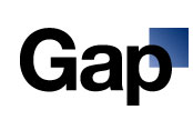
Gap’s redesigned logo, featured above in its full glory, is so detested that someone created a Twitter vent feed for it. AdFreak, however, speculates that the logo is “intentionally shitty”:
On its Facebook page, Gap now says it’s planning a crowdsourcing project to collect your logo ideas, though the brand insists it likes its own one just fine. The post reads: “We’ve had the same logo for 20+ years, and this is just one of the things we’re changing. We know this logo created a lot of buzz and we’re thrilled to see passionate debates unfolding! So much so we’re asking you to share your designs. We love our version, but we’d like to see other ideas.” Was this planned from the beginning? Perhaps not. But at the very least, Gap is aware of your hatred (aka, “buzz”) and has opened the door to the possibility of fixing the problem, with your help.
Is it just me, or does the new Gap logo actually kind of resemble the Facebook logo?

