This is a guest post by Brandon Laughridge of CustomSigns.com.
An effective call-to-action is a critical component of website conversions. It should not be limited to ecommerce sites. Every page of every website should have a goal or objective for users to complete and a call to action pushes users in that direction.
So to maximize conversions for your site, here are five tips for writing an effective call-to-action.
1. An Effective Lead-In
Before you even think about creating an effective call-to-action you want to make sure users recognize the need to follow through. You can do this by expounding on the benefits of their response. Identify a problem your product or service fixes and talk about that right before the call-to-action.
Think of the infomercials that play through the middle of the night. Right before they tell you the price and give you the phone number they tell you how great their product and service is. Follow their example, and briefly tell people why they should respond.
2. The Right Language
Using the right language in your call to action is an important part of converting visitors into customers. To do this you want to make sure and use strong action words like:
· Donate
· Subscribe
· Buy
· Register
· Call
All of these terms build urgency and push the users to take action. To build this sense of urgency even more combine the action words with time-sensitive phrases like:
· Now
· Today Only
· Offer Expires
3. Use Effective Placing
Positioning for your call-to-action is also important. Obviously you want your call-to-action to be above the fold, the higher the better. Place your call-to-action as centrally as possible to ensure that users see it, recognize it and, ideally, click on it.
4. Try Different Colors
Color is a really effective way to draw attention to your call-to-action. Keep your site’s color palette limited, and a bold color choice for your call-to-action will stand out even more.
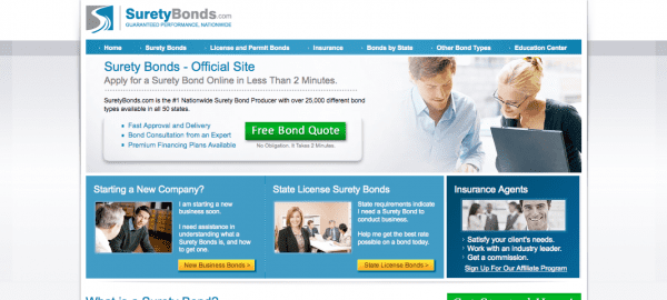
Take my friend’s site, SuretyBonds.com, as an example.
Note the green button in center of the screen? This is an effective use of color to draw attention to a call-to-action.
5. Bigger is Better
Sometimes designers hesitate to make a button or call-to-action as big as they could be. They typically have perfectly legitimate reasons for doing so, but it can sometimes mean missing out on conversions. Make your buttons as large as possible to ensure they are noticed.
Sometimes a big button can be tacky, but sometimes that actually helps conversions by making the call-to-action stand out even more than it would normally.
With these five steps, you’ll be able to draw visitors’ eyes where you want and ultimately translate users into conversions. Remember that these website tips don’t apply merely to ecommerce and lead generation sites; they can be effectively used to increase email signups on your blog, obtain more leads, or increase the number of phone calls you receive.
This guest post was written by Brandon of CustomSigns.com. They specialize in custom sign printing for a variety of industries with an emphasis on helping small business entrepreneurs.

