How many times have you clicked on a search result only to land on a page that’s just not user friendly? If you’re like most Internet users, it’s a regular occurrence. And, like most, you probably click that back button within seconds. However, when you find a site that has a great interface and you seem to automatically know how to use the features, you bookmark it just as quickly so you’ll always know how to find it again.
If this sounds like you, check out these sites. Every one is extremely usable with a great user interface–they’re definitely worth a place of honor on your favorites list.
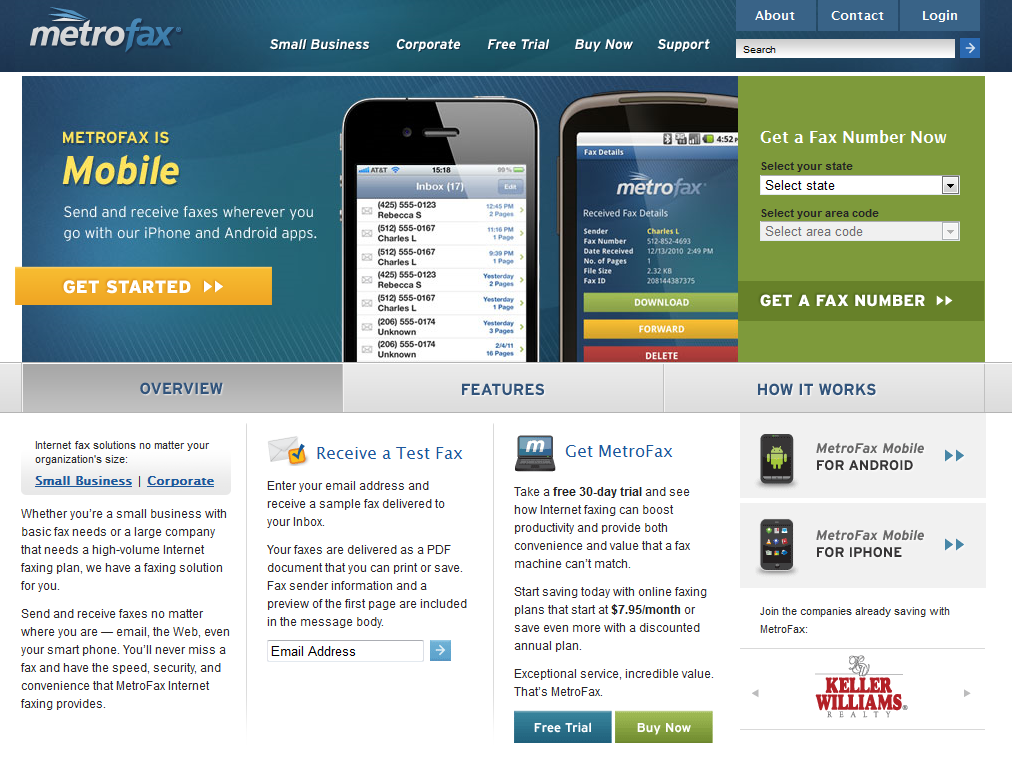
Metrofax
This company recently launched their new site on May 3rd. As you explore the Metrofax Internet Faxing redesign, notice that the site’s purpose is instantly recognizable and you can immediately see how to navigate the site. “Overview” “Features” and “How it Works” is clearly right in the front under a slider box- your eyes are drawn to whatever information you would need. If you saw the old site you would notice how much it’s changed.
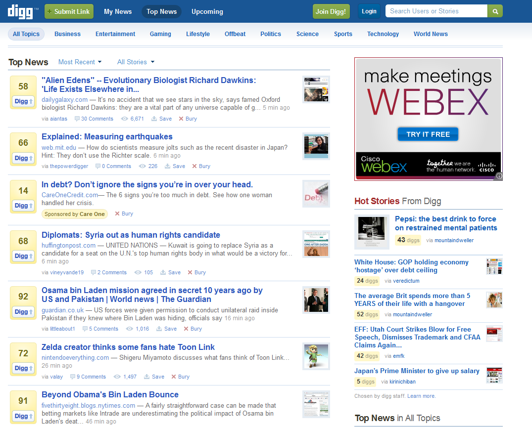
Digg
Digg is an increasingly popular site that offers a great looking and fast-loading user interface- and while there are some qualms about the change in interface and usage, you have to admit that it’s a bit cleaner. If you have a lot of content to put on your site, but you don’t want it to look too busy or cramped, you can’t find a better example of an exceptional format.
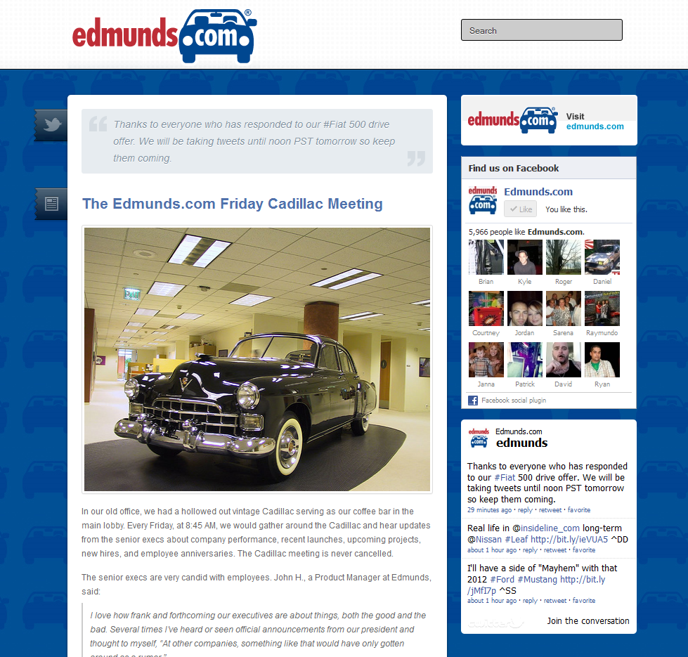
Edmunds
Edmunds recently ventured off their blog and made an Edmunds Tumblr– where they’ll be focusing more on sharing their company culture (such as Edmunds’ rides) rather than general publisher informaton. You’ll see that they pulled in the colors and designs of the Edmunds site, while keeping the layout nice, clean and evenly spaced.
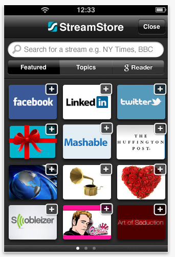
Taptu
The beauty Taptu is that they’ve taken simple to a new level. Notice the big buttons that instantly catch your attention and draw the eyes to the navigation tools. It has also effectively used all of the available screen space to display a ton of thumbnails without overwhelming the viewer.
Yellow Pages
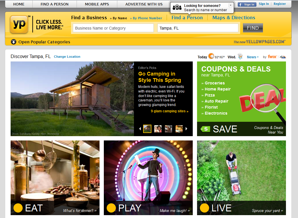
When the Yellow Pages took their famous phone directories from those legendary paper versions to an online model, they carried their branding, including that vivid yellow color, with them to give users a familiar experience. As you view this site, notice the effective use of spacing to emphasize important information.
Amazon
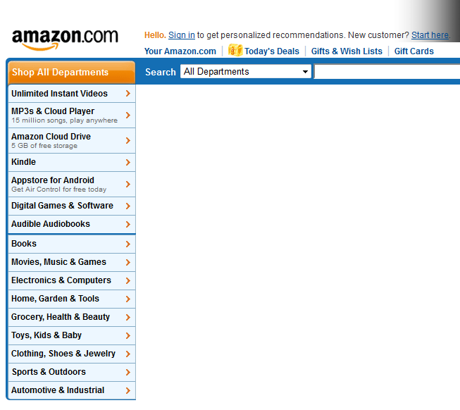
Some of you may not know this, but Amazon started off primarily as a bookseller. It was the go-to place to find the most obscure publications imaginable. Now that they’ve spread out to other markets, they’ve continued to make shopping easy and reliable through an extremely usable interface.
Bank of America
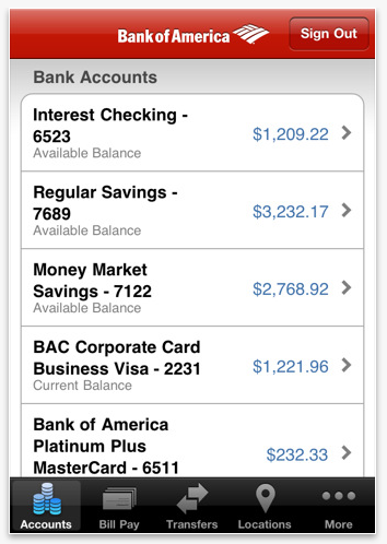
As a mobile app, Bank of America has made this program extremely simple and intuitive. When you arrive at the home page, there’s no question about what the over-sized buttons mean. Click one to sign in, another to find nearby locations and others for information about Bank of America and online banking in general.
Whether you’re using the full-blown version of Facebook or the mobile app, all those dedicated users can’t be wrong. This site features one of the richest, yet easy, interfaces in today’s online world. It loads fast, provides tons of content, looks great and even noobs can use it with ease. Not much to improve on here!
As you review these sites, you’ll be pleasantly surprised by their usability.
What website do you love that has a great interface?
